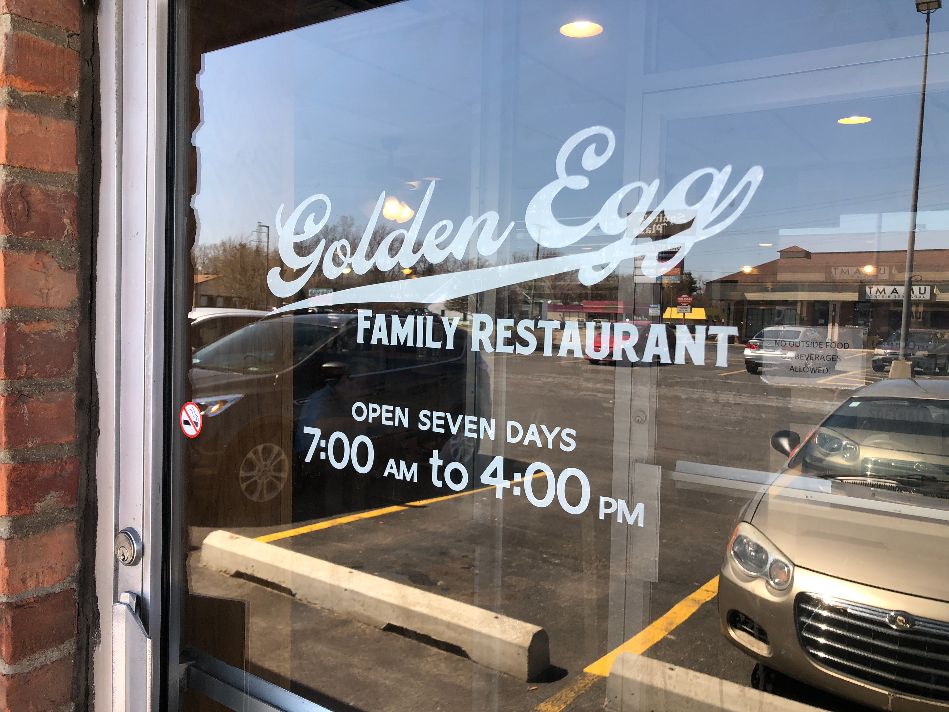
This is my local greasy spoon of choice. Their doors, though? Uh. Let's just say they do signage about as well as I make breakfast, so I was happy to work with them on some vinyl lettering.
There were a number of factors I kept in mind while working on this. I wanted something clean and polished, but not so slick that you'd think it's a chain. I wanted somewhat of a retro feel, but in the service of looking solid and reliable, not gee-whiz-whimsical. And above everything, legibility was the prime concern.